ShopDreamUp AI ArtDreamUp
Deviation Actions
Description
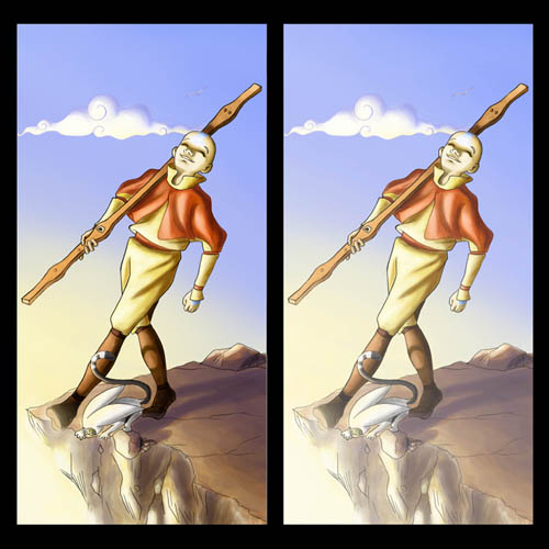
Ok...so this is far enough along I think to submit as a deviation instead of posting to scraps. This is my progress so far on the first of the Avatar Tarot cards I'm working on with some friends. Surprise SOB of this project: light on rocks. OMG! I so wasn't expecting that to be as difficult as it was! I'll admit that there was also something very soothing about twising my brain to see just where the light should fall w/o any reference material to go by, but the stupid cliff alone took me like 2 hours to figure out!
Ok, so here comes the fun part. The foreground and primary images are done fairly to my liking but I still have some quandries.
1) The background: from what I've read, the fool card is supposed to have the energy of daylight, setting off on a new adventure, etc... I opted for dawn as the light setting for that purpose. My question is whether the colors in the back ground are working. I had some purple in there at first, but then it seemed to clash with the rest of the image so I took it out, but somehow losing it also took away a lot of the dawn feel. Also...there's just a lot of empty space back there. Aside from the little lonesome cloud and barely visible bird, there's nothing going on in the background at all. I don't know that I like that, but I'm also not sure what should be going back there instead.
2) I have a split view because I tossed on an extra layer that gradiates a semi-transparent layer of white across the image on the right. It serves to intensify the light effect from the bottom left corner, but I'm not sure if that's a good thing or a bad thing. What do you guys think?
3) Lastly I just want to know if there's anything glaringly obvious that I missed. I've been staring at this image for so long I I can't tell what's wrong and what's right anymore.
All in all, I'm pleased. I'm glad to be working on art again. I find that I miss it when my muse abandons me. Anyhoo, your feedback is much desired. Thanks for stopping by and stuff!
Update:
After a bit of staring and a bit of feedback, I've decided that the white isn't necessary. It sort of washes everything out too much. If I want more intense light, I can add it myself, and I think the light's pretty intense as is.
Image size
500x500px 86.96 KB
© 2006 - 2024 finem
Comments6
Join the community to add your comment. Already a deviant? Log In
Wow! This is great! Your coloring skills are so awesome! 


